
When it comes to pairing interior colour design and window furnishings it can be hard to know where to start, especially as there are so many options available. In today’s article, we thought we’d take a look at choosing colours for your home and the best window coverings to complement your space.
Choosing colours for your home
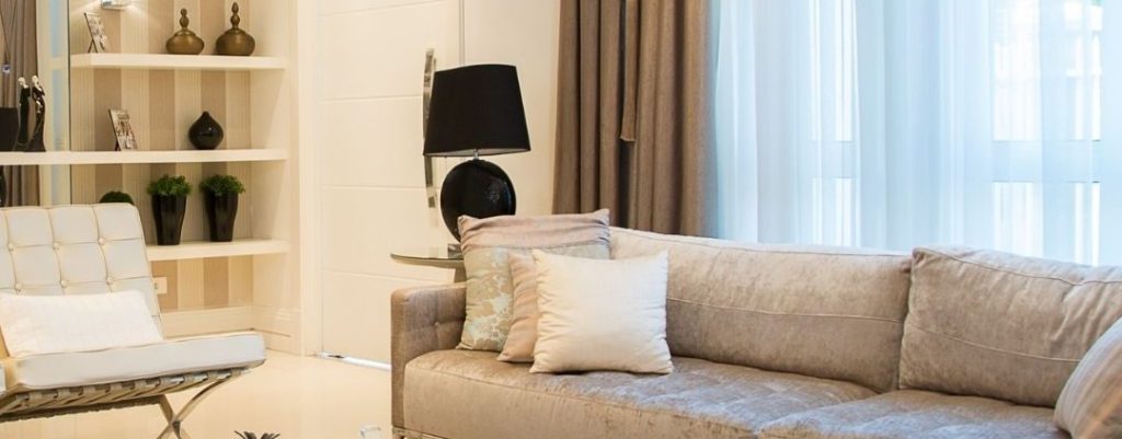
Neutral colours
Neutral colours are the most common colours used in homes and can be beige, ivory, black and various shades of grey and white. These types of colours are popular as they give homeowners more design freedom with decorating and furniture, add some warmth to a space and make a home easier to sell. With this colour scheme, any type of window treatment is suitable as neutral colours are highly versatile.
Looking for quality blinds, shutters, and curtains to complete your space? Browse our range of custom curtains online today or call 1300 303 391 to chat with one of our friendly staff members.
Earth tones
Earth tones offer warmth and natural comfort to a home and can provide a neutral backdrop with an added layer of richness. These colours include everything you can see in nature, such as green, yellow, orange, blue, taupe, and brown. With earth colours, window coverings made from timber material work best. We highly recommend timber shutters and venetian blinds.
Monochromatic
A monochromatic look is less used in interior colour design, as it can be a bit too bold for most people’s tastes. For this style, curtains are often used as they’re the only type of window covering that comes readily available in any colour – though you can get shutters painted to match. Many homeowners choose to match their monochromatic room with patterned drapes to help break up the space and provide visual contrast. If the monochromatic is a simple black and white, any style of curtains and blinds can be used.
Complementary colours
Complementary colour schemes work by combining two colours that are opposite each other on the colour wheel. This kind of interior colour design is commonly seen in graphic design but can be very overpowering in interior design if not done correctly. As complementary colours tend to stray to the bright side, most designers will opt for curtains as they’re available in a wide range of colours.
Neutral with pops of colour
For the best of both worlds, many homeowners choose a neutral colour scheme with pops of vibrant colour. This can be done by having a neutral wall colour and pops of colour with furniture, pillows, and art or by incorporating a bright/patterned feature wall to break up the space. As the neutral colour is the backdrop, any kind of window covering can be used.
Two tone
Two tone interior design involves using two main colours, which can either be both neutral, neutral, and bold, muted bright colours or if you’re feeling daring, two bright colours. As a tone colour scheme gives you plenty of combinations, it’s easy to find a window covering to match.
Interested to Learn More?
We hope you’ve enjoyed reading our article on ‘Interior colour design and window coverings.’ If you need any help picking a window covering for your space or choosing colours for your home, you can contact U Blinds Australia by calling 1300 303 391 or stopping by your nearest showroom to see our indoor blinds, shutters and curtains in person.